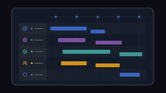
 Tools
ToolsGantt Chart Maker
Create a Gantt chart from a task list, project brief, launch plan, or schedule notes. Map start dates, end dates, durations, dependencies, task owners, progress, and milestones on a visual project timeline.

Lay every task as a solid bar across a twelve-week axis and color it by the team that owns it—copper for design, blue for build, green for test, purple for release—so a glance down any week shows who holds the schedule. Drag a bar to reschedule, snap it to whole weeks, and drop a milestone diamond on launch day.
A gantt chart plots project tasks as horizontal bars along a time axis, showing when each one starts, how long it runs, and how the work overlaps week to week. This template lays one task per row across a numbered week grid, fills each bar with a solid color tied to its discipline lane, and marks key dates with a milestone diamond under a header that carries the project name and its start-to-end span. Flowacts places each new task in the right lane and keeps the axis and bars in step as the plan shifts.
Most gantt charts drown a simple schedule in dependency arrows, resource columns, and percent-complete bars nobody keeps current. This template shows only what a team scans for: which weeks a task covers and who owns it. When the visual final draft slips from W3 to W5, someone drags the copper bar two columns right, it snaps to the week, and the whole team sees the new plan the moment they release. Design, build, test, and release each read as their own color, so a crowded handoff week shows up as a stack of bars, not a spreadsheet you have to decode.
Each row holds one task as a solid bar spanning the weeks it runs, colored by its discipline lane and marked with a 3px tab in the same shade. A header carries the project name and a start-to-end span you can edit, milestone diamonds sit on key dates like the store review or full launch, and a copper dashed cursor marks the current week. Guided prompts place tasks in the right lane and keep the week axis and every bar aligned.
Reach for this template when a cross-functional team plans a release across several weeks, when work hands off through design, build, test, and launch phases and everyone needs to see the sequence at once, or when a fixed ship date means the whole schedule has to fit on one screen. It suits any plan where which weeks a task covers matters more than tracking a completion percentage.
Click “Use Template” to open a new canvas with a gantt chart already prepared.
Set the project name and its week span, then list each task with the week it starts, the week it ends, and the discipline lane it belongs to.
Create a week-numbered timeline with one solid bar per task, colored by lane, plus milestone diamonds and a dashed cursor marking the current week.
Ask Flowacts to add a task row, slide a bar to a later week, extend the span, or drop a milestone as the release date firms up.
Skip the frustration of staring at a daunting blank canvas—our templates do the foundational setup work for you right away.
Each bar carries the color of the lane that owns it, so scanning a single week tells you whether design, build, test, or release holds the work—no legend-hunting or cell-by-cell reading. Flowacts drops every new task into its matching lane, so the color language stays consistent as the plan grows.
Grab a bar to slide the whole task, or pull either edge to move just its start or end week, and everything snaps to clean week boundaries. Drag past the last column and the axis extends itself another week, so a slipping deadline never means rebuilding the chart from scratch.
Edit the project's start or end date in the header and the week columns redraw instantly, with every bar rescaling to match. Because the axis is generated from the span rather than typed in by hand, the timeline and the task bars can never drift out of step.
Got a question about how this specific canvas behaves? Here is what you need to know before you get started.
A gantt chart is a horizontal bar chart that shows project tasks along a time axis. Each bar represents one task—its position marks when the work starts and its length shows how many weeks it runs. Because the bars sit on a shared timeline, you can see at a glance which tasks overlap, which run back to back, and how the whole project stretches from start to finish.
A timeline lists events in order and highlights key dates at a high level. A gantt chart goes further: it breaks the work into individual tasks, draws each as a bar with a real duration, and shows which tasks run in parallel across a dated axis. Put simply, a timeline is the headline view of a project, while a gantt chart is the working schedule underneath it.
Each color marks the discipline or team that owns a task. In this template design bars are copper, build bars are blue, test bars are green, and release bars are purple, so a lane's color tells you who is responsible without reading a single label. Coloring by ownership makes a busy week easy to spot—several bars in different shades signal a phase where multiple teams work at once.
List every task your project needs, then decide which week each one starts and ends. Group the tasks by the team that owns them, mark the big moments—an approval, a store review, a launch—as milestones, and set the overall date range. On this canvas you fill the template with those details, then drag the bars to fine-tune the schedule as your plan gets clearer.
No. This template leaves out dependency arrows and completion bars on purpose, so the schedule stays clean and quick to read. It focuses on the two things a team checks most—which weeks a task covers and who owns it—rather than the heavier project-management machinery. If your plan hinges on strict task-to-task links, a dependency-based tool fits better; this one is built for fast, visual release planning.
Yes. The chart stays editable throughout the work—drag a bar to a later week to reschedule it, pull an edge to lengthen or shorten a task, or move a milestone diamond to a new date. If a task runs past the last column, the axis extends itself another week automatically, so the plan keeps up with reality instead of freezing at kickoff.
Browse related template categories to find more workflows connected to this template.
Keep going with templates and tools for the same workflow.
ToolsCreate a Gantt chart from a task list, project brief, launch plan, or schedule notes. Map start dates, end dates, durations, dependencies, task owners, progress, and milestones on a visual project timeline.
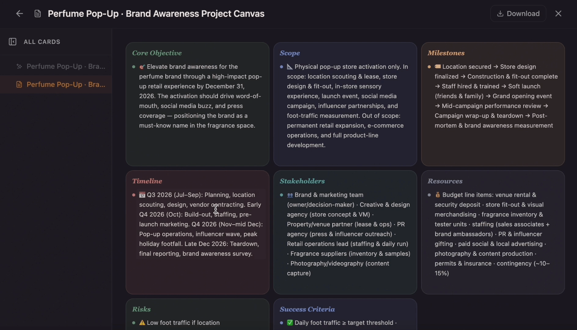 Templates
Ditch the flat spreadsheet and move from scattered task lists to a unified visual roadmap. Select this project management template to instantly generate a tailored workspace that maps out your exact project scope, timeline, deliverables, and blockers.
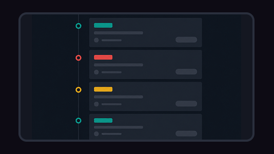 Tools
ToolsCreate a timeline from project milestones, historical events, company moments, campaign dates, or lesson notes. Add the key dates, arrange the sequence, and shape the result into a visual timeline on canvas.
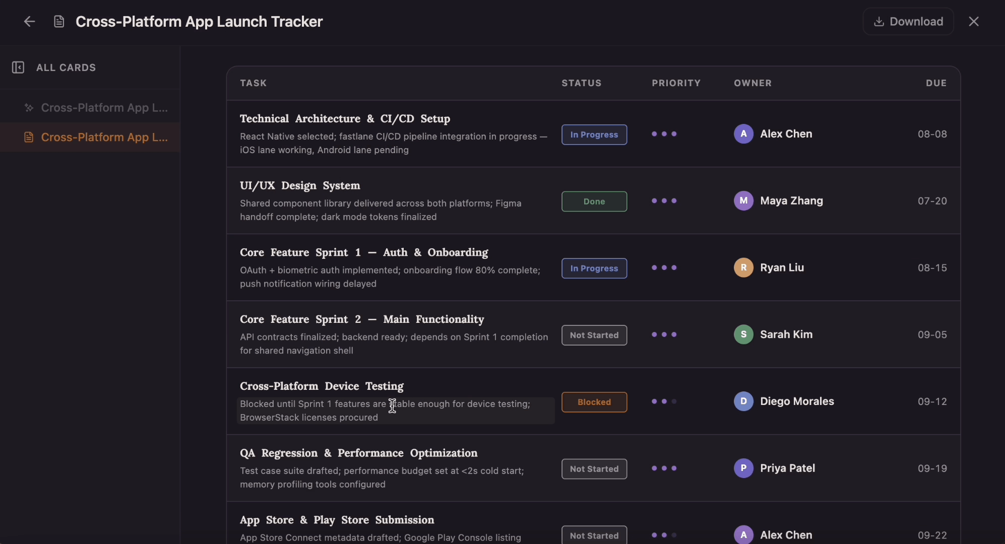 Templates
Which tasks are on track, and which are quietly blocked? This tracker gives every task a row with a four-state status pill, a one-to-three-dot priority, an owner, and a due date that flips to red the moment it slips past today.